How to read a meteogram
Weather charts & diagrams for alpinists and climbers
A meteogram is probably the most complex piece of information you're going to encounter on this site or in our forecasts. Meteograms require some help (therefore this section) and training to understand, but they deliver a lot of meteorological information in just one picture.
Basically, a meteogram is the vertical profile of the atmosphere for a given point and it's development over the forecast-time.
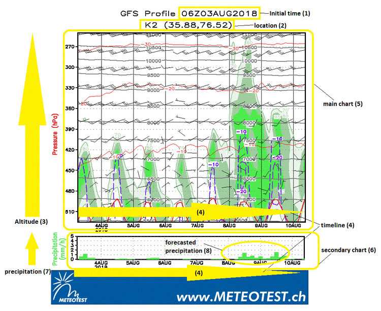
Informations about the point (2) and the starting time ("init")(1) of the forecast is given in the title above the chart.The vertical axis (3) represents the atmospheric altitude. It's labeled "Pressure", because as usual in meteorology, the altitude is given in pressure levels. That's why the labels on vertical axis seem a bit strange and are decreasing from bottom to top. However, you can find the altitudes in meters above sea level as well, they are the fine solid grey lines and numbered labels in the chart itself. On the horizontal axis (4) is the timeline. It begins with the timestamp mentioned in the title and goes on for 2-7 days, depending on the model you're looking at. The times marked in the timelines refer always to the UTC-Timezone. For use in the Himalayas, you typically have to substract 5-6 hours from UTC.
Then, there is a second, smaller plot-field (6) below the main chart (5). Again, the horizontal axis (4)is the timeline. The vertical axis represents precipitaion (7). The scale is fixed and ranges from 0 to 5 mm/h. Green bars in this field (8) indicate, that the model predicts precipitation for your mountain at the given time. The main plot itself is stuffed with solid and dotted lines, coloured areas and windbarbs. Let's go through them step by step.
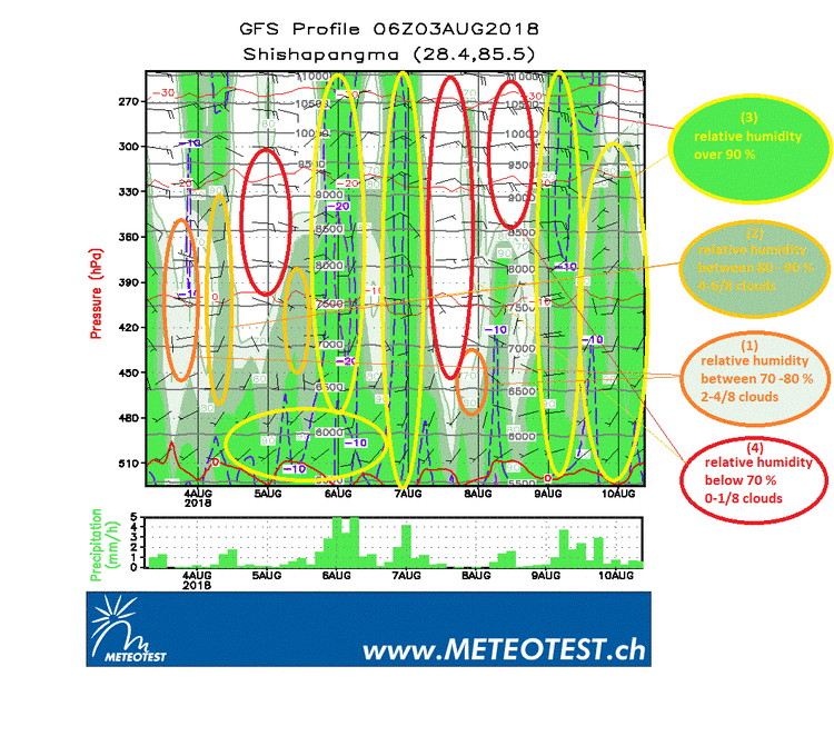
The most eye-catching feature are probably the coloured, green areas. Basically, these areas represent humidity. When the relative humidity of an air parcel is above 70 %, it gets a greenish colour in the meteogram. If you take a closer look, you can see that there are three diffrent shades of green. A very light shade of green (1) indicates a relative humidity between 70 and 80 %, the somewhat darker geen (2) areas mean 80 - 90 % and the strong, brighter green (3) indicates relative humidity above 90 %. You can take the green areas as a quite good indicator for clouds. If relative humidity remains below 70 %, cloud formation is quite unlikely, so you can expect clear air and good visibilty in the white areas (4). Between 70 and 90 %, the cloud cover increases steadily. Cloud coverage is usually measured in octas and descibes the fraction of thy sky which is covered by clouds (4/8 means that 50 % of the sky is cloud-covered), and from 70 to 90 % you can expect 2 to 6/8 cloud coverage. Above 90 % means usually cloud coverage from 7 to 8/8 which translates into mostly overcast/dull or heavy fog.
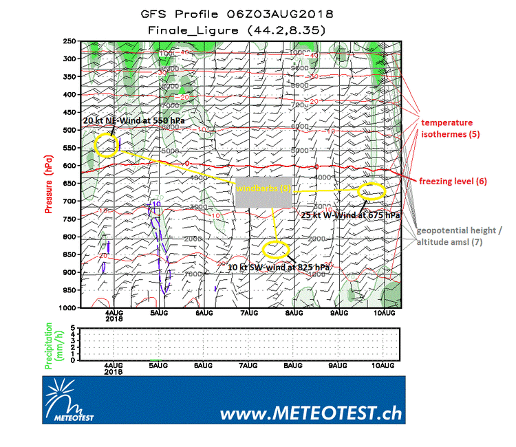
Next feature are the red lines. They are temperature-isothermes (5). The 0-degree-isotherme (freezing level)(6) is slightly thicker than the others and they appear in an interval of 10 degrees. The interpretation of these lines is quite straight-forward, if they are climbing up, tempeatures are on the rise and if they sink, it's getting cooler. The warmest isotherme in the plot is always the lowest and it forms usually a wave-like pattern, due to the diurnal heating in layers close to the ground.
The grey lines (7) we already mentioned earlier, it's the altitude in meters above sea level (or in scientifc terms: geopotential height) corresponding to the pressure levels on the vertical axis. You can expect these lines to remain more or less horizontal, unless there's a significant high- or low-pressure-system coming in.
Then, there are the wind barbs (8). Basically, they are easy to read: they show the forecasted wind speed at a given altitude, at a given time. As often, the devil lies in the detail. First, let's take a look at how to interpret a windbarb. A windbarb can be seen as an arrow. It has a "pointy end" and an end with some barbs attached. While the "pointy end" is fixed to the altitude and time the information is valid for, the direction of the -abstracted- arrow represents the wind direction and the numbers, length and form of the barbs indicates the wind speed. The barbs can be long bars, short bars and triangles. A long bar corresponds to 10 knots, a short bar to 5 knots and a triangle to 50 knots. The predicted wind speed is then the sum of all the bars and triangles on a specific windbarb, e.g. 2 long and 1 short bars mean 25 kt; a triangle, 1 long and 1 short bar mean 65kt. Note that the direction of the "arrow" represents the direction of the wind, so if a barb is pointed vertically down, it means north-wind, if it's horizontal with the pointy end to the left, it's east-wind. In our meteograms, the windbarbs appear in an interval of 9 hours.
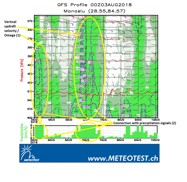
And finally, there are the dashed, blue or purple lines (1) which appear sometimes more, sometimes less pronounced in the meteograms. These lines represent vertical updraft velocity of an airparcel. In areas (or more precise: times and altitudes) where you find these lines, you can expect raising airmasses. Often, this raising airmasses go along with cloud formation and precipitation, except the lifted airmass is very dry - which often happens in arid or semi-arid climates. Usually, the combination of humidity (green fields) and lifting air (dashed lines) leads to precipitation signals in the lower plot (2). Vertical updraft velocity (or physically speaking: omega) can occur due to thermal heating in the lower layers (convection) or can have synoptic forcings such as troughs or frontal systems, sometimes it's also a combination of synoptic and convective forcing. In general, the stronger and widespread the omega is, the worse the weather likely will be.