How to read our ensemble-plots
Weather charts & diagrams for alpinists and climbers
An ensemble plot gives valuable information about the reliability and stability of a model forecast. Basically, an ensemble is a set of multiple models, run for the same period. The single runs all have slightly different initial and boundary conditions.
In our ensemble plots, each of these runs is depicted as a single line. The basic message of the ensemble plots is: When the lines are close together (despite their initial differences), the forecast is quite reliable, when they're apart, it's more of a gamble.
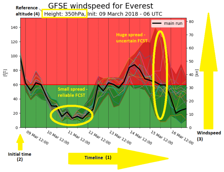
The horizontal axis represents the timeline (1), starting left on the initial time (2) of the forecast.
The vertical axis (3) describes the wind speed respectively the precipitation.
Take care, the vertical axis is scaled dynamically, so you have to look at the labels and you can't necessarily compare the plots one-to-one. To counter this issue, we included a green and a red area into the plot. The value which separates these two is always the same for the same mountain and altitude. Its value is based on experience, usually winds which are in the red area imply real problems for mountaineers, making climbing hard and increasing risk for frostbites massively.
The same applies to the precipitation plots - precipitation signals which reach into the red area might produce abundant rain or snowfall. The altitude for which the wind speed-ensembles (4) are valid is visible in the specific title of the plots.
The nice thing about ensembles is that they not only give you an impression on the reliability of the model forecast, but also a bandwidth or spread in which you have to expect the wind or precipitation for a given time. Trough the fat-marked main run, which is the base for the all the other data, you'll also get an impression of where the main run lies in relation to the possible scenarios.